Artist Statement:
Throughout this semester I have been assembling a body of work that reflects my taste in photography. I have a keen eye for the photos I take, so they are personal and of a high quality. Lately I have been concentrating my efforts towards documenting my youth, where the subjects are myself and friends. I love a good portrait most of all. Close up and centered on the face. Black and White is my preference for all photos, I think that is helps a viewer to concentrate on the subject of the photo with less distractions. Black and White gives the photo a raw edge that lets it be timeless. A quality, which prevents a photo memory from becoming obsolete. And that’s what a photo is to me, a memory. People often say that a picture is worth a thousand words, and I definitely agree with that statement. I would say a picture could be worth even more if you take it yourself.
There have been various assignments this year that have allowed me to photograph my life and lives of others in the style I like to use. Starting with a retro assignment I learned how to use Adobe Photoshop to give my photos a look of distress and age. Along with all the editing techniques the pictures from this assignment turned out very good. Among my favorites of the Photoshop tools were the blur tool, de-saturation and adding noise. All of which helped to give the photos a vintage feel.
My Photoshop skills were heightened once more with the typography assignment. Being brand new to typography it was quite a learning process for me. I learned many new tools and came to find new favorites. Such as adding a gradient and putting a curve on the letters. In the beginning I thought it was ridiculous to ruin a photo by adding words. In the end I was really inspired by the poems of Connie Wonack and Louis Jenkins. Some of my favorite photos of the semester came out of this assignment. Once I learned how to incorporate words in to the photo, I started to really enjoy typography. Even considering it as a later career.
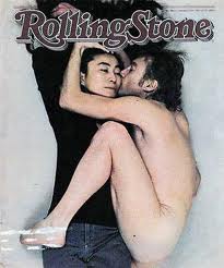
The final assignment being Annie Lebovitz style warped up the year. Not only did I enjoy her photography I enjoyed learning about her life and career. I found her to be an inspiration. She has had such a great career and still has many years of photography ahead of her. It was a great challenge to try and emulate her style, and one that I enjoyed. She took many portraits so that is what I concentrated on for this assignment. I used her style of lighting but changed it from sets and planned photos to more candid poses. I was happy with the final results, and would be interested to hear Annie Lebovitz’s opinion of them as well.
Overall I would say the semester was a success. I learned countless Photoshop tricks and had the time to practice them. I learned about lighting and how to correctly frame a photo. But most importantly I was able to exercise my own stylistic techniques as an amateur photographer. Which I hope to build on throughout my entire life.

 .
.


